Company:
Impact AI
My role:
UX
Tools:
Figma, Miro, Notion
Duration:
6months
Overview
I led the end-to-end design of an AI governance task management MVP for a fast-moving startup. The goal? To simplify chaotic compliance workflows into something usable and scalable.
As the sole designer, I collaborated with stakeholders, developers, and an AI governance expert to shape the brand, define key product flows, and deliver a high-fidelity prototype. The result was a tool that helped teams manage complexity with clarity and confidence.

Why does the AI governance feel like a maze?
Through user interviews with AI product managers and governance specialists, I uncovered a fundamental problem:
Governance was overwhelming, with too many moving parts to track effectively.
Tasks were disorganized, leading to missed deadlines and unfinished projects.
Teams felt overwhelmed by the sheer complexity of compliance.
Without a map, even the smartest teams get lost.
A blueprint for success.
What if governance felt less like a mess and more like a checklist?
I designed a solution rooted in clear structure and automation:
Templates that brought clarity, not clutter
Automated flows to reduce manual overhead
Interfaces that surfaced only what mattered
This approach became the foundation for a smarter, simpler governance experience.

Turning research into results.
To understand how governance breaks down in practice, I started by reviewing interviews previously conducted by our CEO with AI product managers and compliance leads. I mapped key themes, pain points, and workflows across teams.
Most were managing tasks with scattered tools like spreadsheets, Notion docs, and Slack threads. This often led to confusion, duplicated work, and growing compliance risks.
To build usable templates, I translated dense governance requirements into scalable, user-friendly workflows. This involved researching frameworks, identifying common friction points, and working closely with our governance expert to ensure the system was accurate, adaptable, and clear.
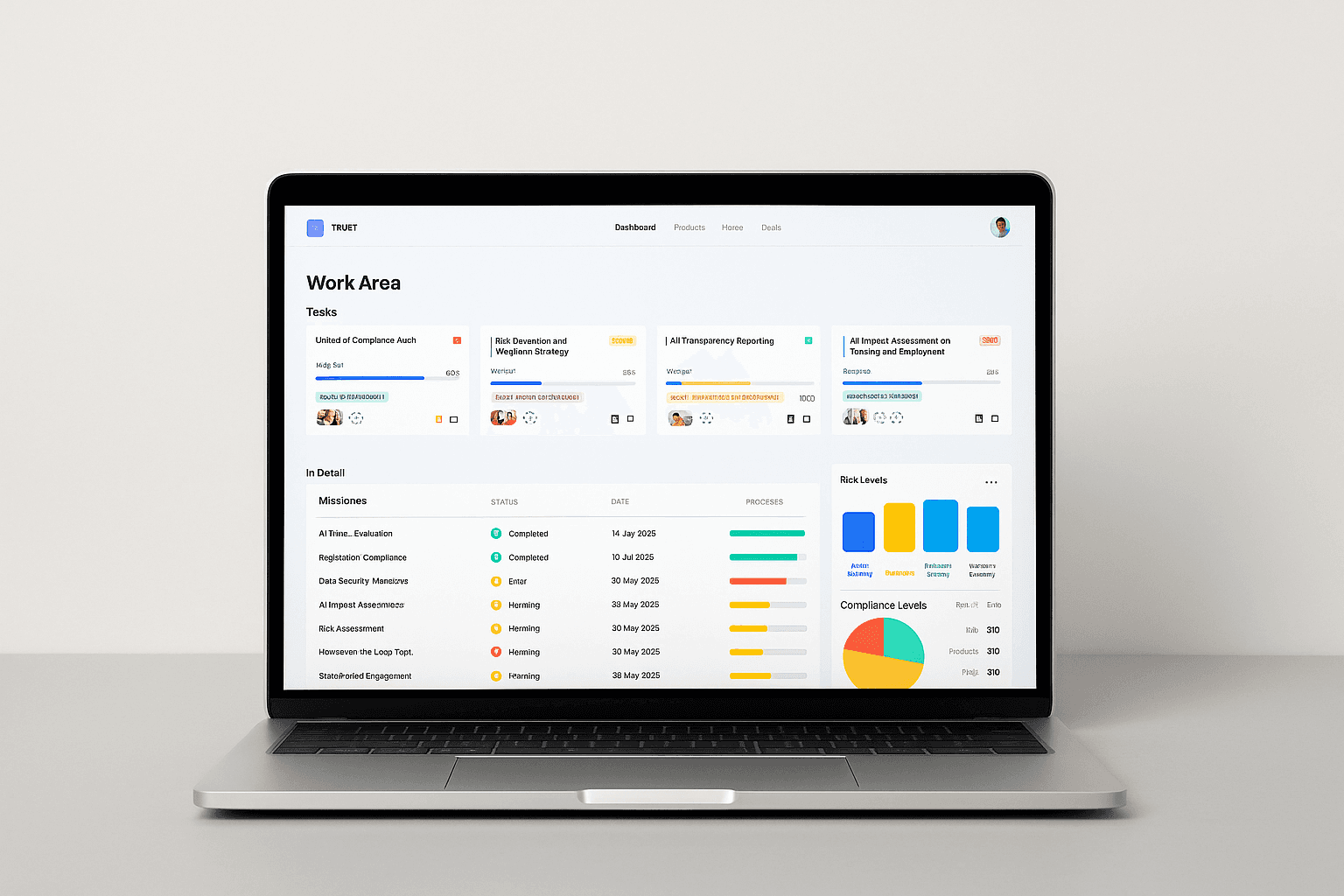
Designing for clarity
With early-stage constraints in mind, I focused on designing something modular, scalable, and realistic to build.
I worked closely with our engineers and the CTPO to align on priorities, delivering wireframes and a design system that could support the app’s growth over time.
We focused on:
A clean dashboard that helped users focus on what mattered
Templates that could flex across teams and use cases
A design system built for speed, clarity, and long-term consistency
By staying tightly aligned with dev, we ensured the designs were not just thoughtful but actually buildable.

Small team, big challenges.
Startups come with trade-offs.
Limited dev resources meant we focused only on high-impact features
Without access to formal user testing, we gathered feedback through conferences and early demos
Accessibility was noted but scoped for future updates
Even with these constraints, we shipped a functional and effective beta.
So, did it work?
Beta users loved the structure and clarity. For the first time, compliance felt manageable.
The product didn’t launch publicly due to technical setbacks, but the feedback was clear, we were solving the right problem, in the right way.
What I learnt along the way.
Constraints can be frustrating, but they often lead to surprisingly creative solutions.
Clear communication and close collaboration make everything move faster and better.
Good structure does more than organize. It helps people think clearly.
And honestly? I learned way more about AI governance than I ever thought I would :)
Note: Certain details, including visuals, have been altered to comply with NDA restrictions.